
Choosing logo colours and shapes
Naomi Booth :: Friday 24th June 2016 :: Latest Blog Posts
Logo Colours and Shapes
What do different colours and shapes mean to people?
Logo Colour Choice
Logo colour choice speaks volumes to the customer. Think green and it is all about eco, high-end and growth. Like Waitrose, BP and Body Shop. What about yellow? Brightness, standing our from the crowd and value. Like McDonalds, SubWay and Lidl.
There is also the emotional side of colour - how they make you feel - I love the fantastic info graphic showing a huge range of logos and suggested emotions. How do they make you feel?

What about Logo Shape
Logo shape also conveys a sense of what your company is about.
Think of a circular logo like Intel, BMW and Starbucks. They have themes of inclusion, unity, stability and endurance.
And what about the harder looking rectangles and triangles? Companies like Mitsubishi and Adidas use these shapes to suggest balance, strength and masculinity.
Logo Design
It is interesting to look back at logos we have designed and see these choices come together to create logos that work.
Project Uganda
![]()
The strong rectangle at the base of this logo reflects the strength of the project, the balance of man and nature is suggested with the tree softening the hard rectangular form. The green colour reflects the hope for ecological growth and prosperity that this charity offers.
Waistcoat Festival Logo
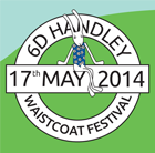
This circular logo speaks about the community as a whole, getting together and being involved. The blue and green behind are creating feelings of peace, inclusion and stability.